TrendThread Journal
Tutti Frutti Fashion 2027: The Clashing-Brights Guide
Somewhere around your seventeenth all-beige outfit this year, you felt it: the neutrals were finished. Here is your early-adopter guide to tutti frutti fashion 2027 — the deliberate clashing of brights taking over the SS27 runways.
Picture this: you open your closet and it is a wall of oatmeal. Beige knit, cream trousers, taupe coat, greige sneakers — the full quiet-luxury uniform, worn on rotation for three straight years. And if you are honest? You are bored out of your mind.
Good news: fashion is bored too. The Spring/Summer 2027 runways just staged a full-blown color riot, and the boldest, most joyful direction has a name straight from the candy aisle. Tutti frutti fashion 2027 is the art of wearing brights that technically should not go together — tangerine with fuchsia, cobalt with tomato, lemon with lavender. Not one bright piece politely balanced by neutrals. Actual, deliberate, glorious clashing.
The evidence is everywhere. Byrdie counted seven distinct clashing color combinations at New York Fashion Week’s SS27 shows. Paris answered with a vitamin-C overdose: Balenciaga’s Pierpaolo Piccioli floated citrus-orange chiffon gowns down the runway while Hermès ran orange through shirt dresses, maxi skirts, and handbags. This is not a whisper of color — it is the whole fruit bowl.
Consider this your early ticket: the combos that actually work, the rules that keep you chic instead of chaotic, and exactly how to wear them before everyone else catches on.
Why the clash is happening now: the quiet-luxury backlash
Fashion runs on pendulum swings, and the pendulum just snapped. For three years the dominant visual language was restraint: neutral wardrobes, barely-there makeup, discreet accessories — the “clean girl” uniform and its rich cousin, quiet luxury. It was elegant. It was also, eventually, visual starvation.
The verdict from fashion month is blunt: fashion is having fun again. One widely quoted SS27 assessment put it plainly — “color is returning in a big way,” with turquoise, coral, yellow, and vermilion splashing across the New York collections while red held its power. InStyle’s Kevin Huynh told the AP that designers are waving goodbye to the quiet-luxury era: “more is more,” but intentional — bright, but considered.
Here is my hot take: everyone keeps calling this dopamine dressing 2.0. They are wrong. Dopamine dressing was a mood — pile on every happy color and hope for the best. Tutti frutti has syntax. Pairs, ratios, echoes. That is the difference between intention and accident on camera. The clashing brights trend 2027 is not chaos; it is choreography.
The honest counter-note: some forecasts see desaturated, lived-in neutrals holding their ground — chalky whites, sun-faded beiges. That is the safe bet. But tutti frutti is the boldest and most fun of 2027’s competing directions — and the one getting photographed. When a trend is this early, that is the one you want to be first on.
Spring 2027 color trends, straight from the runways
Let us talk receipts. New York went first: Campillo paired peach-pink with bright yellow and cobalt; Tory Burch built her “joy of getting dressed” collection on coral, turquoise, violet, mint, vermilion, and butter; Sergio Hudson layered purple chiffon over a magenta skirt — full high-fashion Barney, and it worked; Zankov’s DVF debut mixed purple and green like he had never heard the rule. As Vogue’s Spring 2027 runway coverage confirms, the appetite for louder dressing is back.
Paris turned the volume to eleven with one hero hue: orange. Piccioli sent citrus-shade chiffon gowns down the Balenciaga runway; at Courrèges, Drew Henry cut tailored trousers and a robe coat in a punchier orange; Nadège Vanhée wove orange through Hermès — shirt dresses, maxi skirts, handbags; Miu Miu layered crystal-front orange babydolls over swimwear; and Chanel’s Matthieu Blazy added the accent note with floral embroidery and a croc-effect bag popping against red tweed. Orange is the hero hue here, and it gets its own guide in orange outfits spring 2027.
The forecasters agree: WGSN × Coloro’s 2027 palette is built on Luminous Blue, Energy Orange, and Pop Pink — the tutti frutti starter pack, validated by data. Menswear is going colorful-preppy, with pink, lavender, lemon, and blue as foundations. Even beauty surrendered: Harper’s Bazaar’s Spring 2027 runway beauty rundown shows the maximalism spilling into makeup too.
That is the engine under tutti frutti fashion 2027: not one hero color, but the friction between two or three of them. The question was never whether color is back. It is which colors dare to stand next to each other.
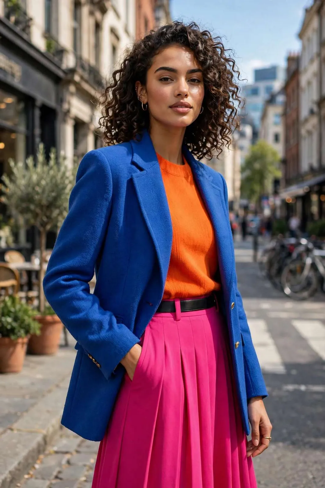
The 5 clash formulas that run the clashing brights trend 2027
Not every clash works — that is what separates tutti frutti from a laundry accident. These five pairings have runway receipts and real-world legs. Steal them wholesale.
| Combination | Vibe | Start with |
|---|---|---|
| Citrus orange + hot pink | Sweet-shop maximalist | An orange knit with a pink bag — let accessories do the clashing |
| Cobalt blue + tomato red | Electric and edible | A cobalt blazer over a tomato tee; white sneakers keep it daytime |
| Lemon yellow + lavender | Sorbet soft-clash | Lavender trousers with a lemon knit — the gentlest entry point |
| Chartreuse + navy | Acid prep | A navy base with one chartreuse accessory; the preppy way to go loud |
| Poppy red + butter yellow | Picnic maximalist | A butter dress with poppy shoes; red lip optional but encouraged |
A few opinions. Orange + pink is the headline act — Piccioli proved it at couture level, and it is the most forgiving since both share warm undertones. Cobalt + tomato is the power move and the best office-safe clash. Lemon + lavender is the beginner’s pick — and honestly the prettiest of the five.
Chartreuse is the wildcard: the color people fear most and the one that gets the most compliments, because nobody else is wearing it. And poppy + butter is pure joy — the picnic-blanket combo that photographs like golden hour even at noon. Butter is the softest bright in the clash — see butter yellow outfits 2027 for the sunny side of the palette.
The golden rule across all five: tutti frutti fashion 2027 rewards commitment. Half a clash looks like a mistake; a full clash looks like a decision. Pick your pair and go all in.
How to wear bright color outfits 2027: the 2:1 rule
This is the part where most color guides chicken out and tell you to “add a pop of color with accessories.” No. For bright color outfits 2027 that look intentional, you need the 2:1 rule.
Build every tutti frutti outfit from two brights and one anchor. The anchor can be a neutral (white, denim, chocolate) or a third bright. Two brights fight; three brights converse — but only if one color repeats somewhere, even in a shoe or a bag.
That is the whole operating system. Cobalt blazer + tomato top + white jeans: two brights, one anchor. Orange dress + pink bag + pink sandals: two brights, and the pink echo is the anchor.
Three more rules do the heavy lifting. Keep silhouettes boring — loud colors want simple shapes. Let texture bridge the gap: matte cobalt next to glossy tomato silk reads curated. And mind the neckline — put your most flattering color near your face.
Neutrals whisper. Tutti frutti winks at you from across the room — and you wink back.TrendThread color desk
And the myth-busting moment I promised: everyone says brights are only for summer. They are wrong — here is why. Burnt orange with chocolate is a fall masterpiece; cobalt on navy is winter’s best-kept secret. The SS27 runways showed these for spring, but tutti frutti fashion 2027 does not check the calendar. Wear the fruit bowl year-round.
Start where the commitment is cheapest: a bright color blazer thrown over everything you already own instantly drafts your neutrals into the trend.
Body types, occasions, and real-world rules
Runway is fantasy; your Tuesday is real life. At the office, let one piece do the talking: a cobalt blazer over black tailoring, or tomato trousers with a cream shirt. Client-facing day? Keep the clash below the waist. The boldest end of the bright palette lives in our fuchsia outfits guide.
For weddings (as a guest — never the bride), let fabric civilize the color: a tangerine silk dress with pink heels. Steer clear of pale lemon near bridal territory. Date night is where tutti frutti earns its keep — orange + pink is flirty without trying too hard.
Body-type notes: if you are petite, stack your clash vertically — two clashing colors, top and bottom, elongate instead of chopping. If you are curvy, try a column of one bright with the clash in the jacket — it frames rather than fragments. Tall? Carry head-to-toe clash; the rest of us are jealous.
This is how tutti frutti fashion 2027 works off the runway: same syntax, smaller stakes.
- Pick your pair from the five formulas — commit, do not audition
- Apply the 2:1 rule: two brights, one anchor
- Echo one color somewhere small (bag, shoe, lip)
- Keep silhouettes simple; let color be the statement
- Put your most flattering color near your face
- Wash new brights separately the first three times — color-bleed is real
Check them off and you are early to the trend — which is the whole point of a 2027 forecast.
Fabrics, care, and budget vs. runway
Brights are honest little snitches about fabric quality. Chiffon, silk, and cotton poplin carry saturated hues beautifully — that is why Piccioli chose chiffon for those citrus gowns. Avoid shiny polyester satin in bright colors: it reads costume-shop. Matte or softly lustrous beats high-shine on any budget.
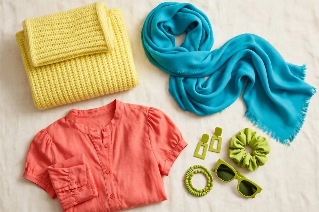
Care matters more with brights than anything else you own. Wash new saturated pieces cold and separately for the first three washes — color-bleed is real, and one tomato tee can pink a whole load of whites. Inside out, no hot dryer, and keep them out of baking sunlight.
Do you need designer prices? No. The smartest way to buy into tutti frutti fashion 2027 is the bright-third-piece strategy: one saturated blazer, a colorful silk blouse, a cobalt blue dress — over neutrals you already own. Thrift stores are goldmines; an ’80s blazer in electric blue costs less than lunch. If you want to see how one shade becomes a whole trend, Who What Wear’s breakdown of the cobalt-blue wave is worth a read.
Start with one formula, wear it this week, and watch what happens. Strangers will compliment you — beige never got anyone stopped on the street. Browse the shop section for our current bright picks, and catch more early forecasts in the journal.
Is tutti frutti fashion 2027 actually wearable for work?
Yes — with one rule: a single clash element inside professional tailoring. A cobalt blazer over a black sheath dress reads creative-director energy, not chaos. Save the full three-color clash for creative workplaces and weekends.
What if bright colors wash me out?
Keep the brights away from your face. Wear tangerine as trousers, cobalt as a skirt, lemon as a bag — and put your most flattering shade near your neckline. The clash still reads.
Which color clash should a beginner try first?
Lemon + lavender. It is the softest clash on the list — pastels colliding feel like a whisper, not a shout — and it works with pieces you probably own. Graduate to cobalt + tomato when you are ready for the power move.
Will this trend last past spring 2027?
The evidence says yes: orange has been building across SS26, resort, and couture, and WGSN × Coloro locked brights into the official 2027 palette. Color cycles run multi-season once they tip, so one or two bright anchors now cover you either way.